Summary
Think of this as a quick overview. Explore the full case study to follow my complete journey of turning complex data into clarity.
Redesigned cloud.yellow.ai’s analytics visualization system to transform cluttered, inconsistent charts into clear, meaningful tools for decision-making.
Through improved color semantics, adaptive chart types, simplified interactions, and newly added configurations helped users interpret data faster, reduced Excel exports, and significantly increased confidence across technical and non-technical users enhancing the overall analytics experience.
Faster data interpretation
40%
Reduce excel exports
50%
Reduced visualization queries
65%
Increase in Dashboard adpotion
20%
The Problem
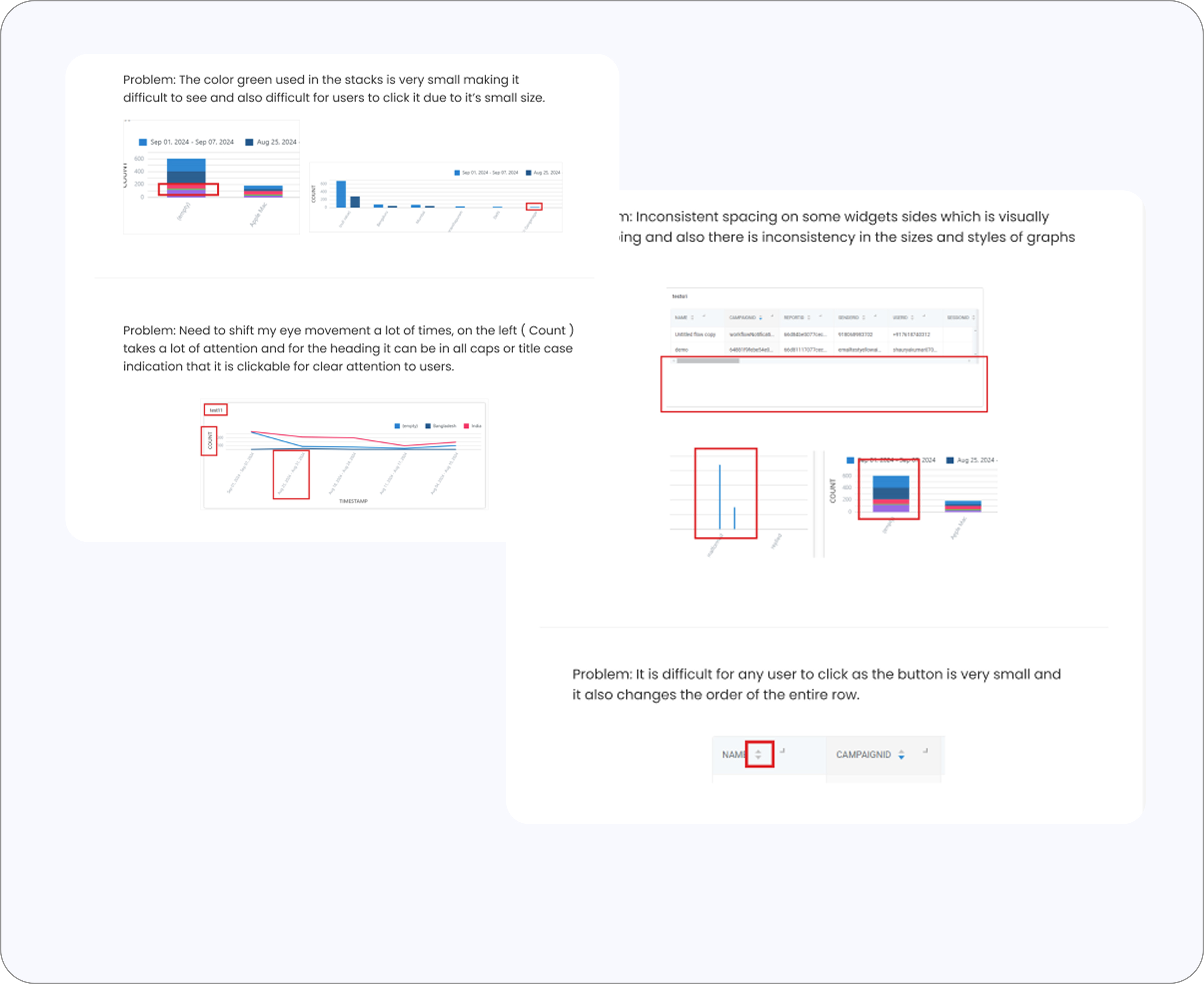
The dashboard is not helping users decode information but instead creating more work.
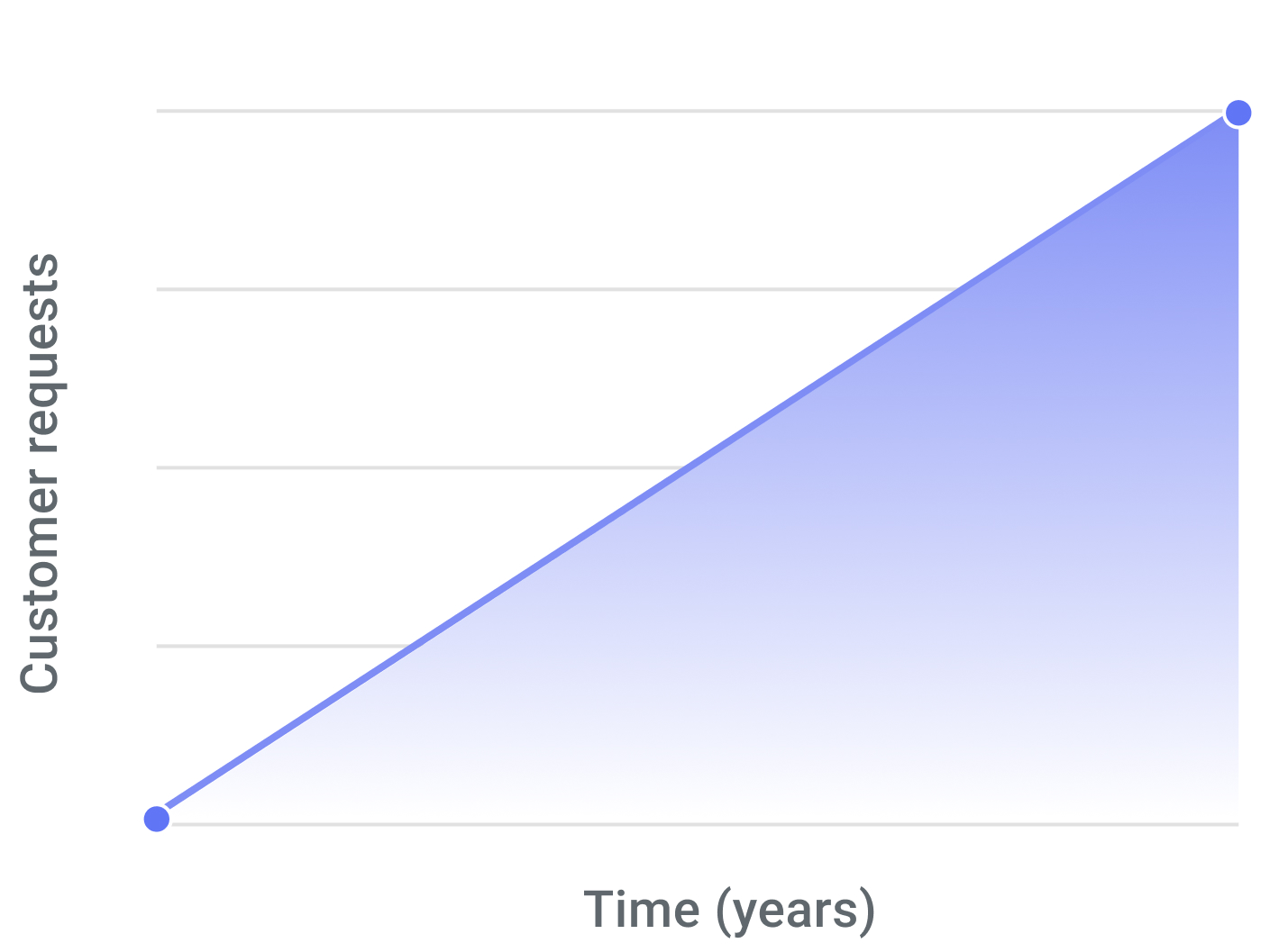
Increase in number of customer queries for charts and configurations over time.
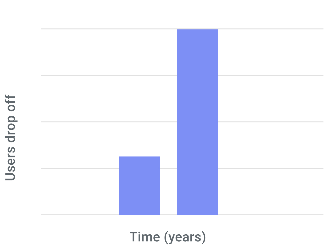
Rise in user drop-off and dependency on external tools for analyzing data.
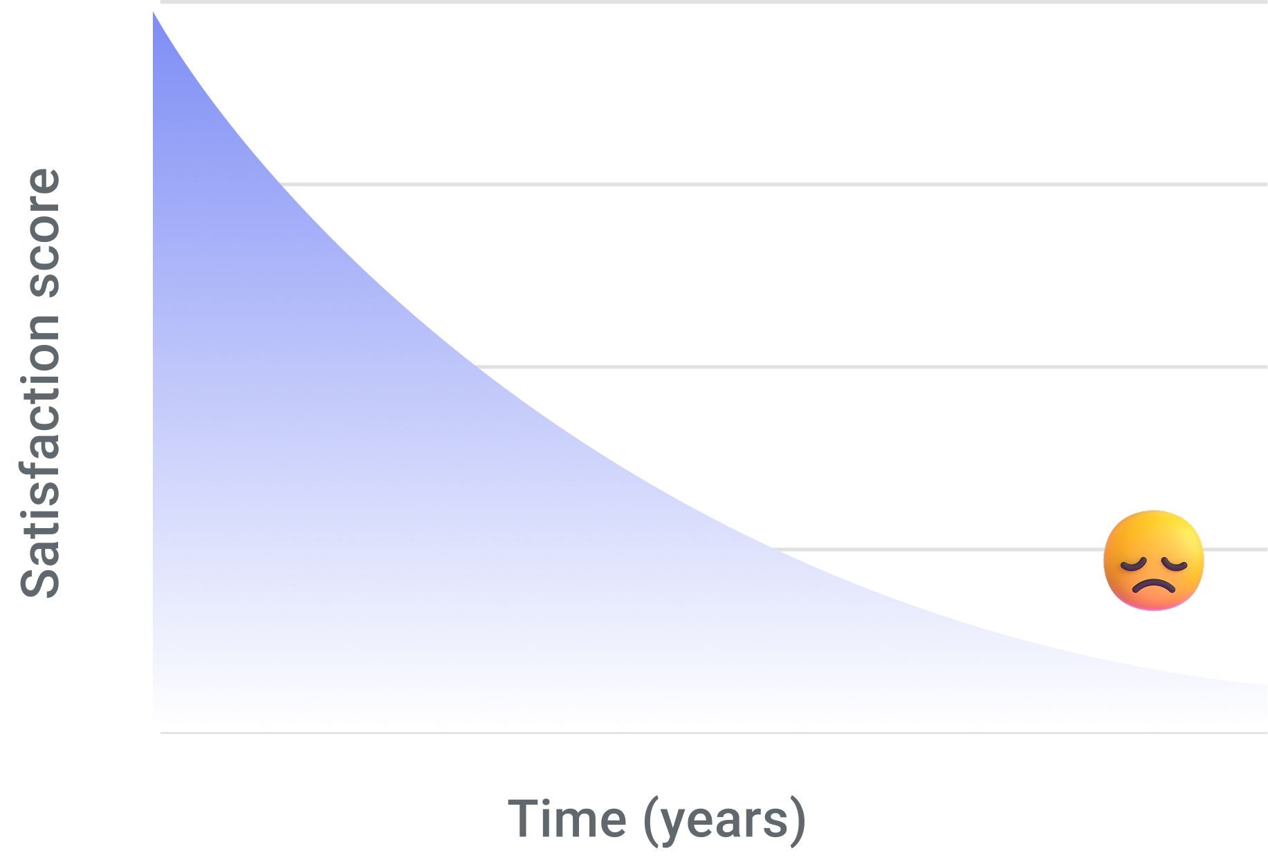
The current charts configurations does not meet the market expectations.
The following above are some points that were highlighted by Customer Success Manager
Users and Research
Why it started?
It started with rising user frustration and questions about how to use the dashboard, how to read the charts, and what the data even meant.
A short conversation revealed a bigger truth charts were creating friction. Users loved the data but couldn't understand it without exporting to excel or manual workarounds.
Who are we solving for?
We divided users into power users and non power users.
- Power users - Power users are individuals who work deeply with data and use analytics tools extensively.
- Non-power users - Non-power users use analytics occasionally and usually need quick, simple insights rather than complex exploration.
How are we solving it?
We conducted a thorough audit of our product’s usability and market position through extensive desk research, a detailed heuristic evaluation, competitor benchmarking, and an in-depth review of customer requests.
We also interviewed analysts and managers to uncover key user pain points.
Heuristic evaluation
Revealed inconsistency, clutter, poor hierarchy, and low discoverability.
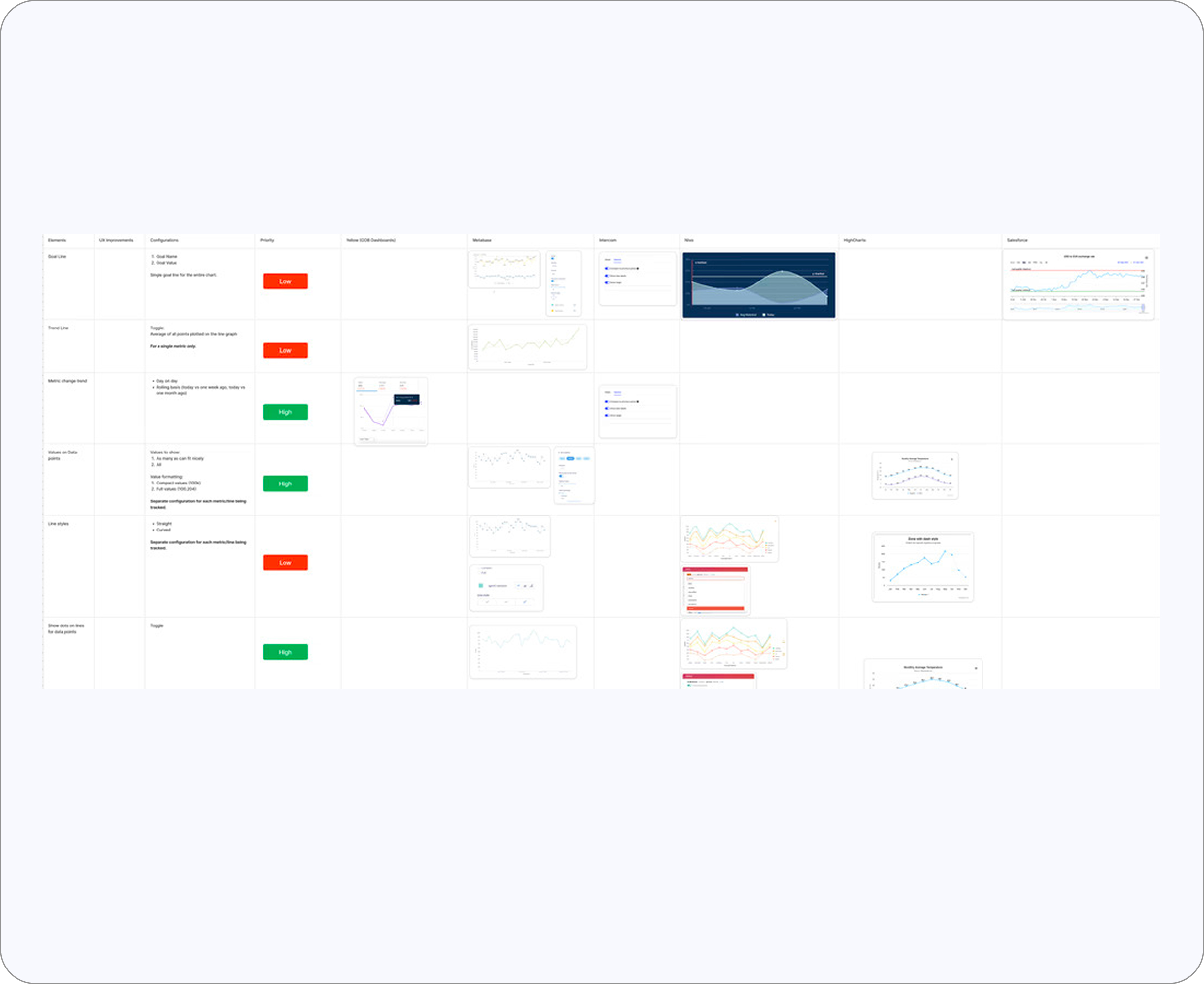
Competitive benchmarking
Revealed modern standards our dashboard lacked
Frustrations & Findings
The deeper I went into interviews, call recordings, customer tickets and heuristic evaluations, the clearer it became: users didn't have a problem with the numbers. Their real struggle was with how those numbers were visualized and some key features and flexibility they get in other external tools.
Frictions We Set Out to Fix

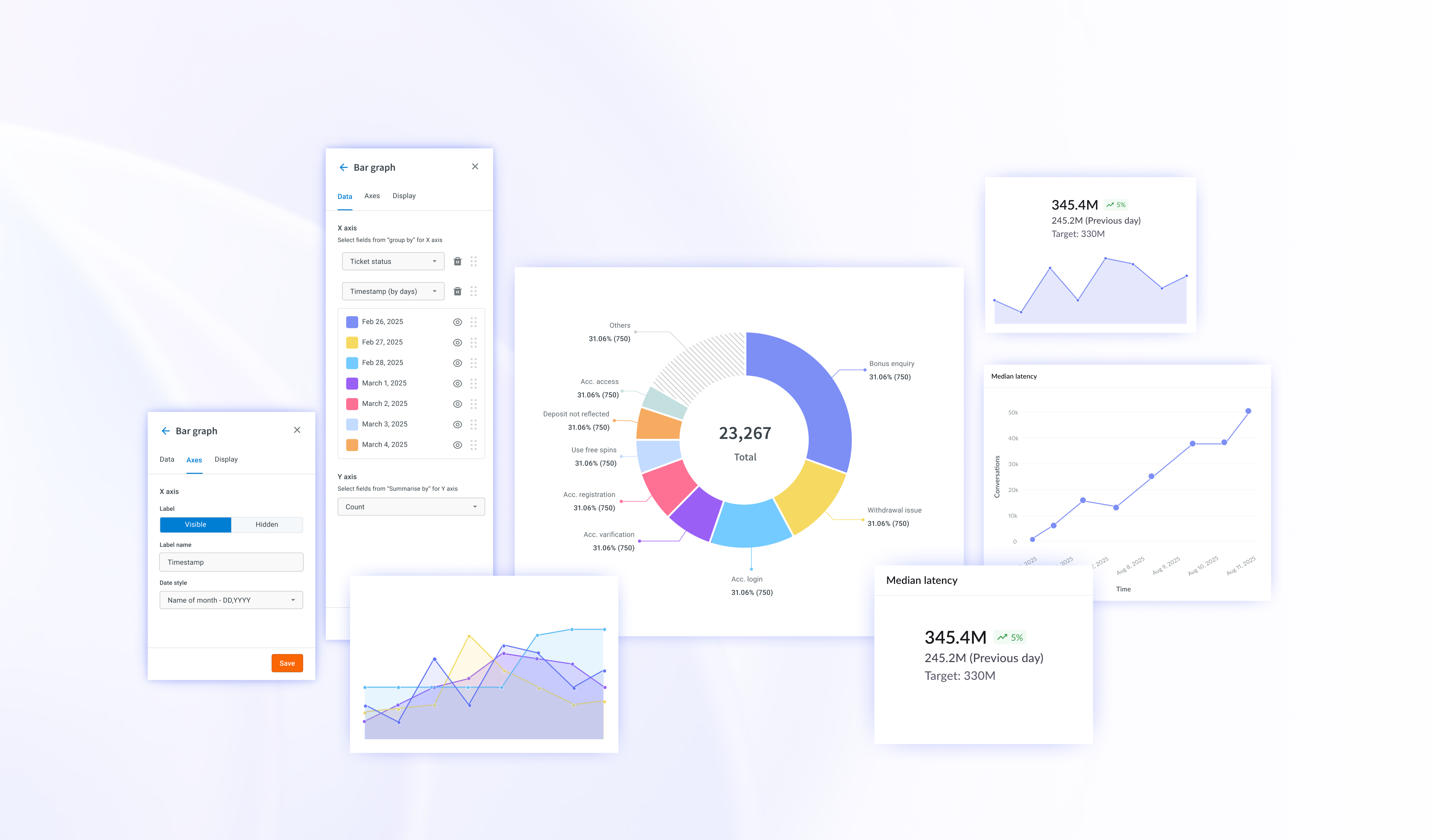
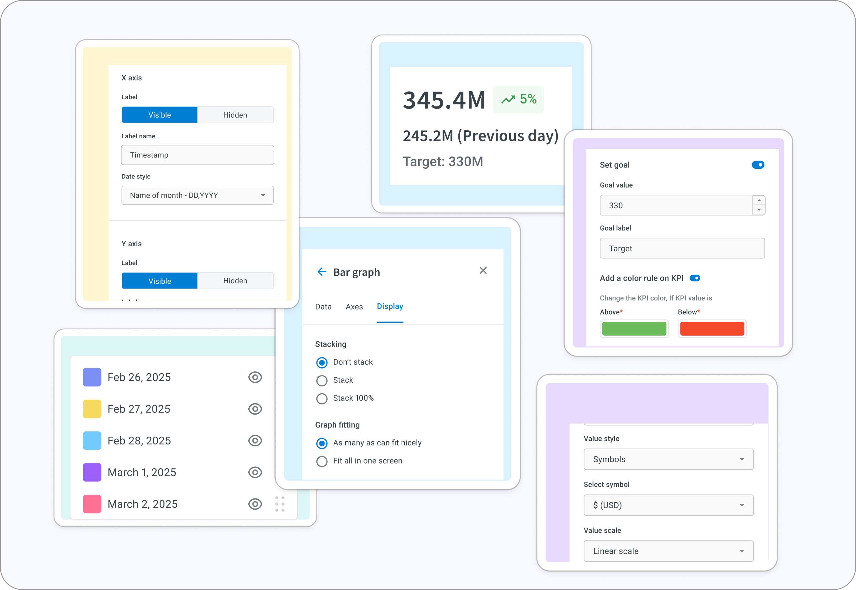
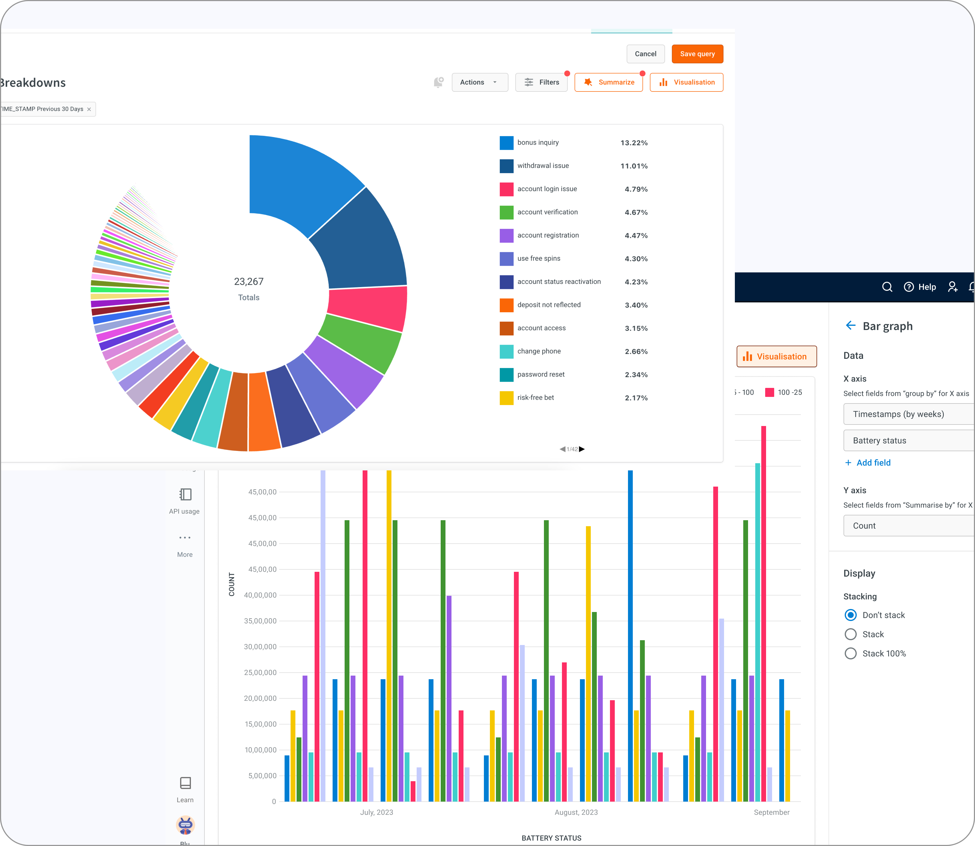
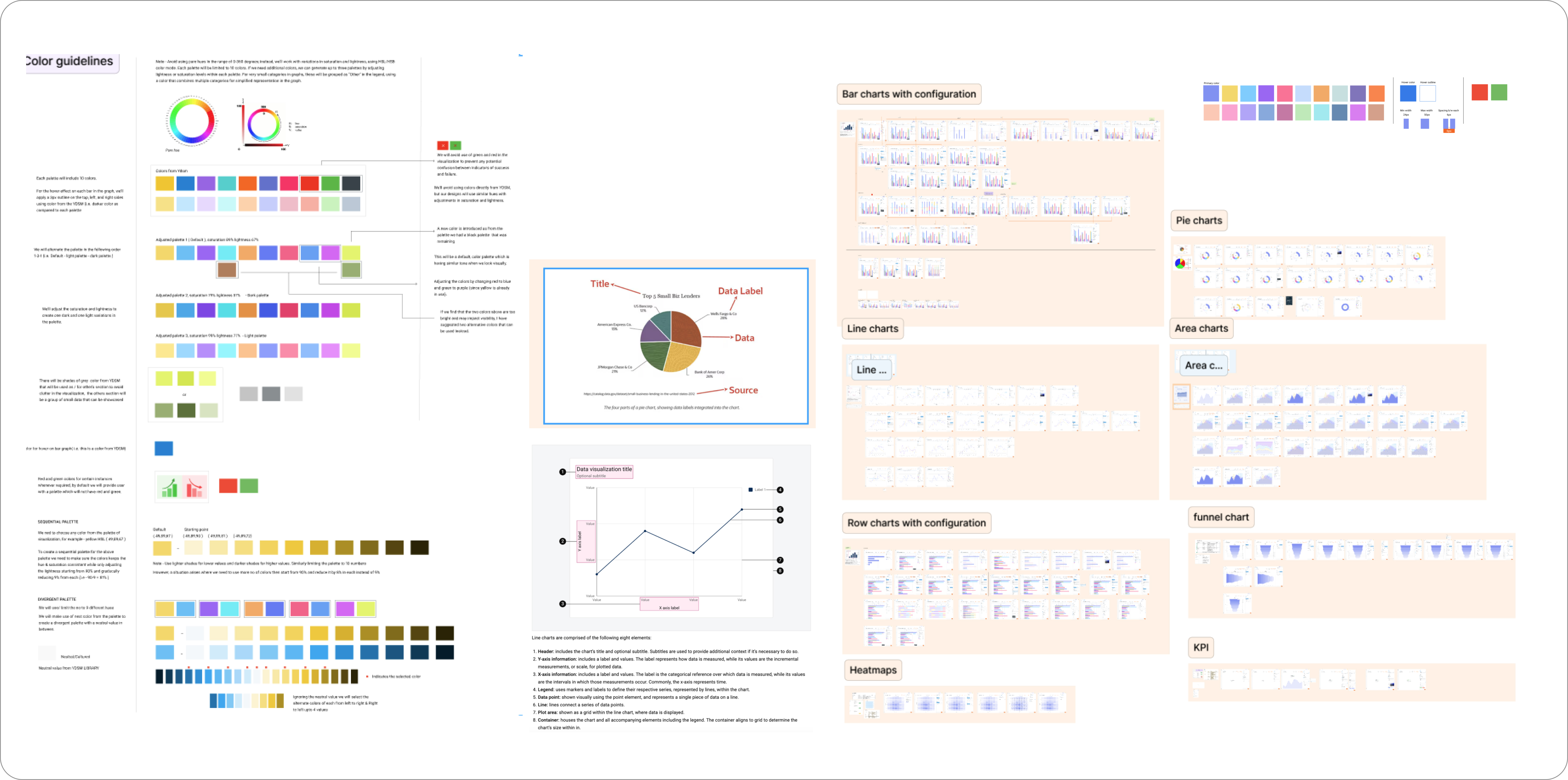
Redesign
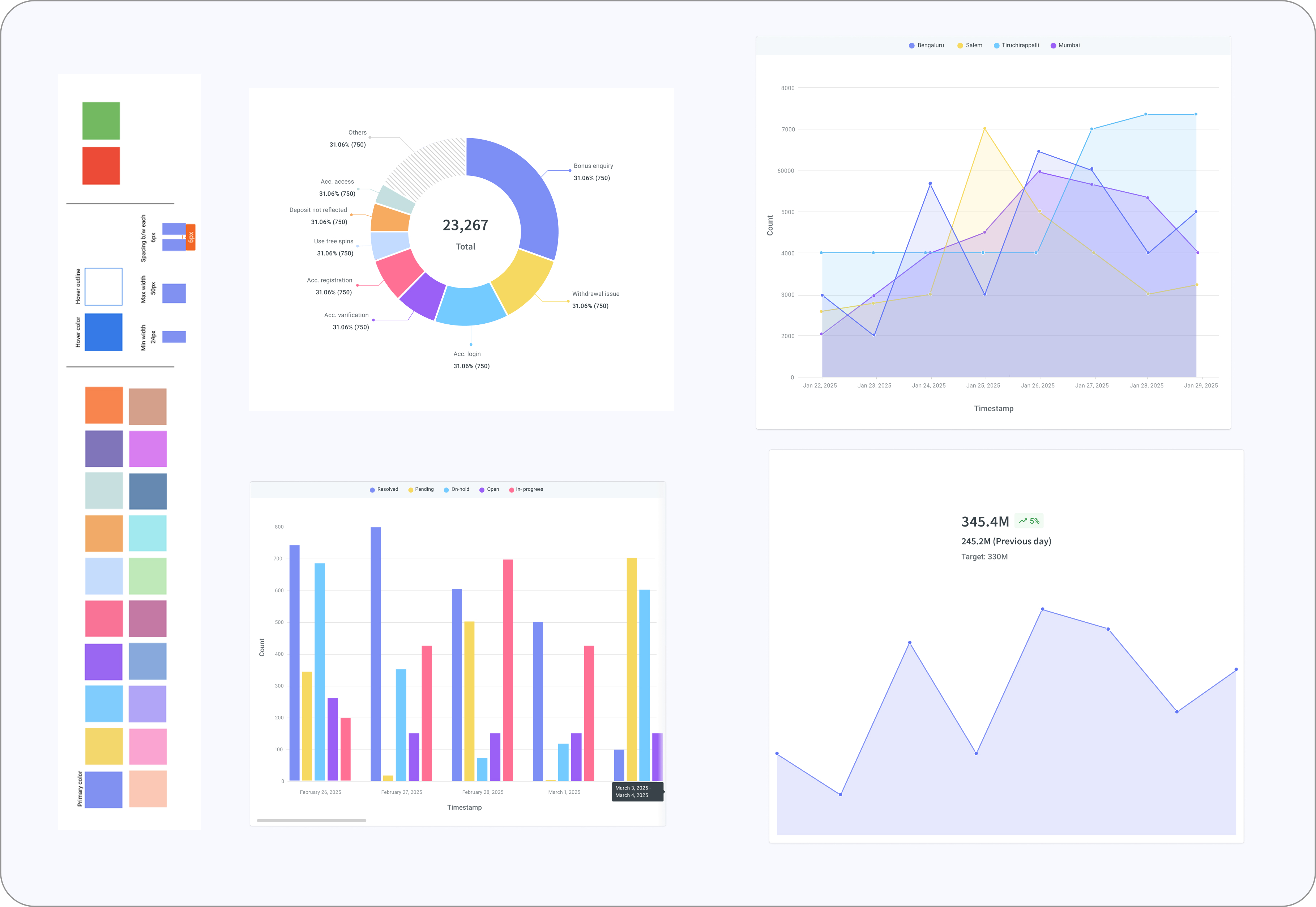
Introduced new visuals & Colors With Intent
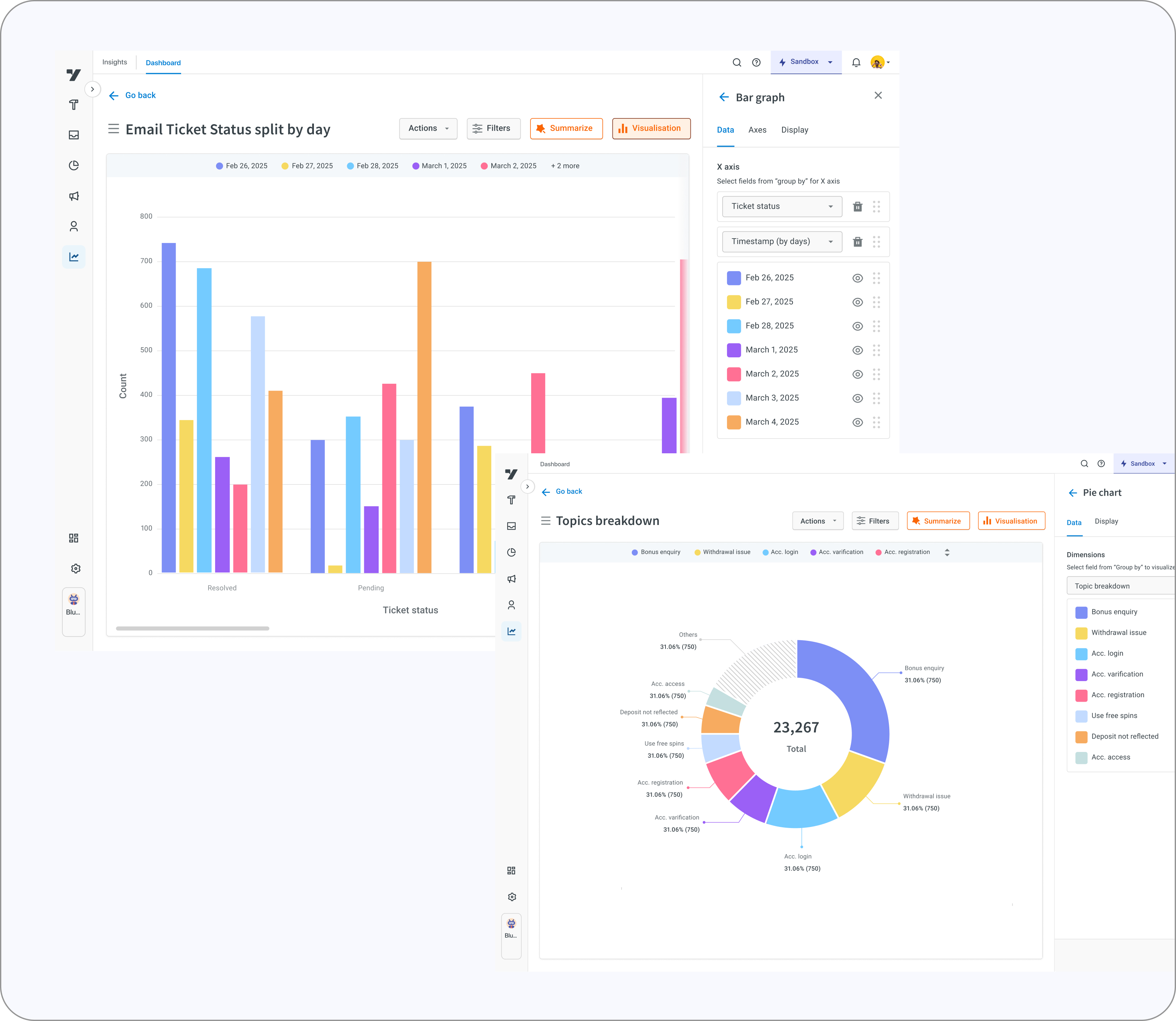
The interface was redesigned to be clean, structured, and purposeful. Colors now communicate meaning using thoughtfully selected palette and similar tones not being sharp to the users when looking at a lot of data or lesser and helping users instantly distinguish patterns, thresholds, and alerts.
Alongside this, we introduced a more expressive visualization system with new chart types, clearer configurations, and smarter controls. These enhancements didn’t just improve the look and feel of the platform they made interpreting data more intuitive, flexible, and efficient for every user.
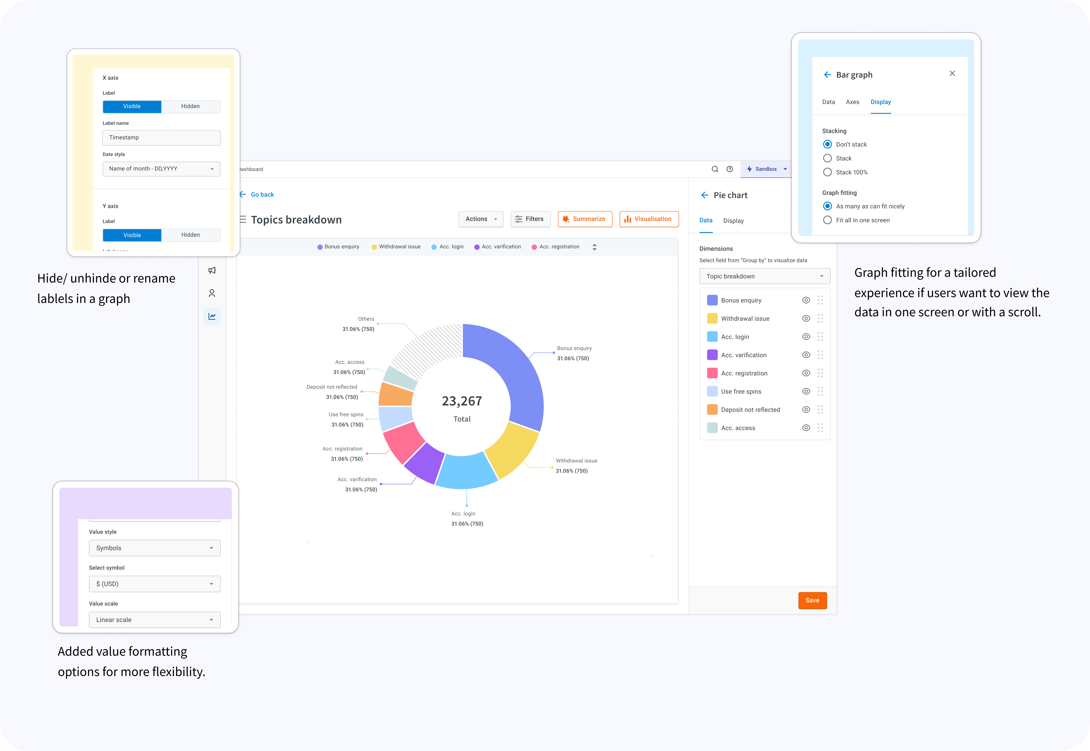
Intuitive Controls that Don’t Need Instructions
Interacting with charts became effortless because the controls behaved exactly how users expected:
- Toggle legend items to focus on what matters
- Hide a line when the view is cluttered
- Rename labels in-place to make insights relatable
- Switch between chart types without losing context
- Expand charts when data density increases
Removed Visual Noise
I stripped out anything that added weight without adding value.
- Excessive gridlines that cluttered the view
- Random, inconsistent spacing across charts
- Overloaded tooltips that tried to say too much
- Decorative icons that served no analytical purpose
- Tiny typography that made interpretation harder
- Introduced “View All” and scroll graphs and other’s section to reduce clutter and make data easier to understand.
This update went beyond aesthetics it redefined data interaction within our Insights module, minimized the need for third-party BI tools, and made insights quicker, clearer, and truly actionable.
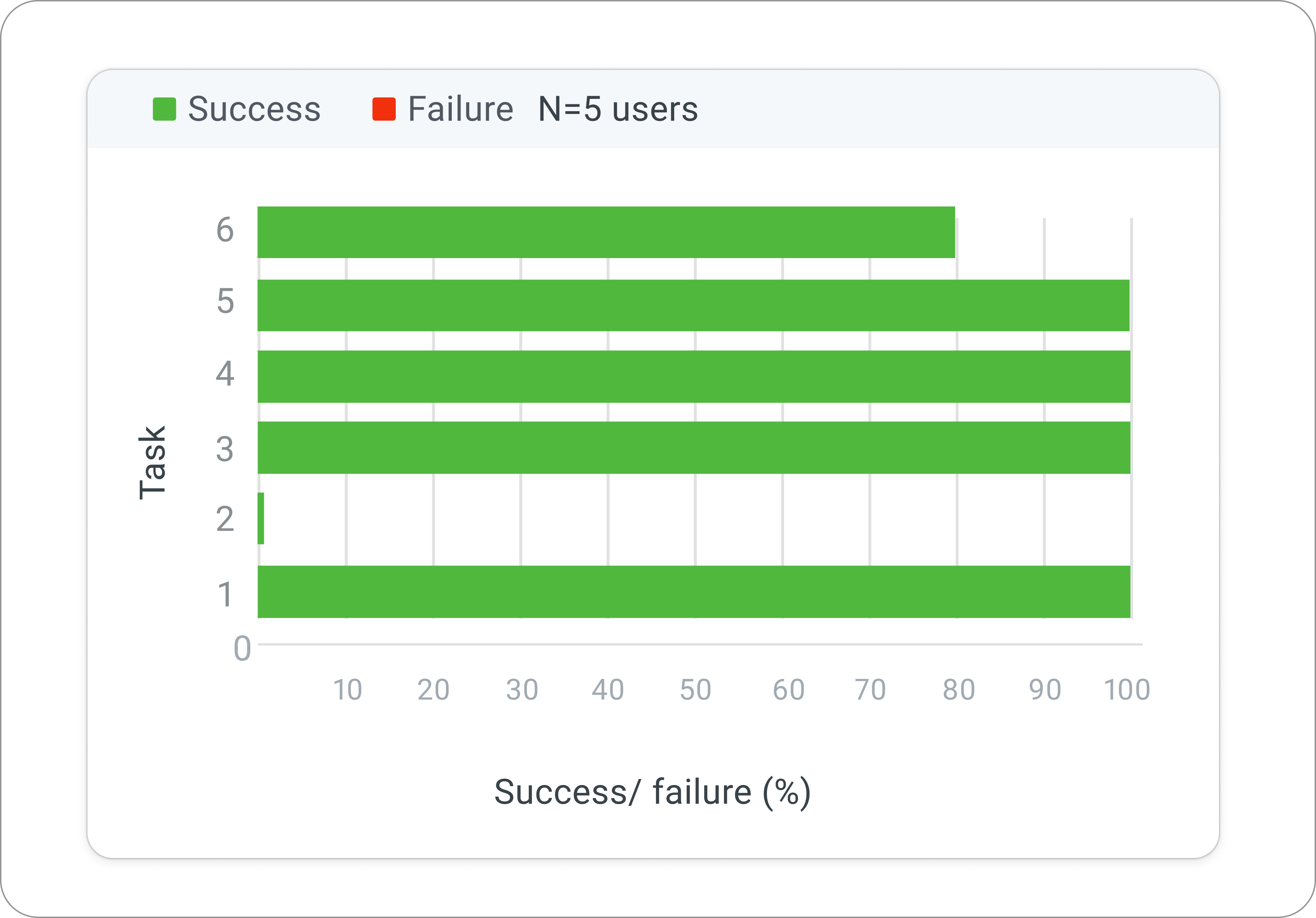
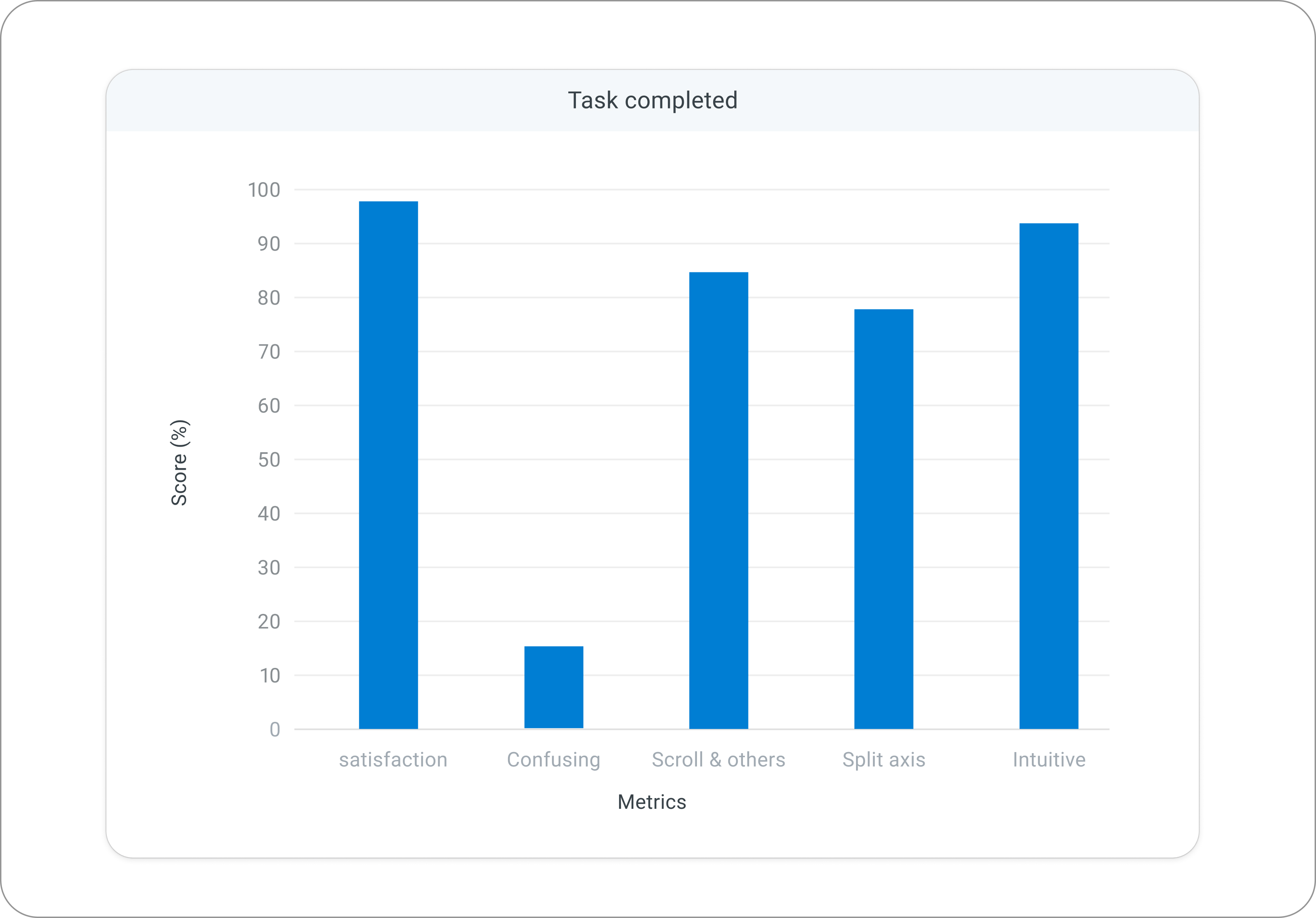
User Testing
We tested the prototype with power and non-power users asking them several question and assigning them tasks to perform on the new features, tabs and experience to validate the outcome.
The wins that made me happiest:
Once the usability tests was complete, the results were clear- the redesign wasn’t just visually appealing, it was genuinely meaningful, intuitive, and easier to interpret and that feedback came directly from users.
- Non-power users were finally able to understand data without assistance.
- Power users appreciated the flexibility, saying the charts felt “easier to customize with and offered more control.”
- The dashboard felt lighter, and users loved the refreshed color palette along with the ability to customize it.
- Labeling, split axes, and goal lines were particularly appreciated; these were features users had been hoping for along with added charts and labels but said it still needed some guidance revealing where tooltips and education were needed
That’s real impact not Where the old charts created hesitation, the new ones enabled quick clarity and confident decision-making. However, Advanced tasks (like split axes) still required guidance.
Snippets
Before & After
Designs and explorations
Redesign Impact
Faster Data interpretation
Increase in Dashboard adoption
Fewer visualization queries
Fewer excel exports
Learnings
- This redesign wouldn’t have been possible without real user test calls. Speaking directly with users helped me challenge and refine every assumption I had. Their feedback removed guesswork and grounded the design in actual behaviors, not hypotheses.
- Through this process, I deepened my understanding of how different chart types work, what each visualization terminology means, and how users naturally explore and interpret data. It reinforced how critical it is to treat data as the backbone of any visualization decision.
- I also realized that research isn’t just a step in the process it sets the entire direction. Both heuristic evaluation and competitor analysis didn’t just highlight gaps; they shaped the vision for what the new system needed to become.
- And finally, I learned that simplification takes far more effort than adding features. Anyone can add controls, but making them intuitive, discoverable, and genuinely helpful requires thoughtful reduction, prioritization, and structural clarity.
What’s next?
Alerts
Alerts and notification when performace drops below set thresholds
AI - Powered insights
Predictive analysis and smarter recommendation using AI tools
Merge experience
Visualizations to stand out along with dashboard as they work together